本文全面测试了Stellar主题的各种标签组件和特性,作为博客装修的实用指南。文章系统地展示了包括quot引用、mark标记、note备注和hashtag等表达类组件的用法与效果;详细记录了callout信息框、link链接卡片和ghcard卡片等内容类组件的多种样式变化;并演示了诸如icon图标、checkbox复选框与timeline时间线等布局类组件的丰富功能。每个组件都提供了实际代码示例和渲染效果,并标注了实用指数,帮助读者快速掌握Stellar主题的高级美化技巧。
一、 tag-plugins 标签组件 tag 插件的格式都是:
1 {% tag_name [arg1] [arg2] [...] %}
有些类型需要跟结束标签一起使用,如:
1
2
3
{% tag_name [arg1] [arg2] [...] %} content {% end_tag_name %}
有些 {% tag %}` 与 `{% endtag %} 之间还可以嵌入其他 tag。
在 stellar 网站上,作者把标签组件大致分为四类,下面是我分别测试下它们。
表达类标签组件 1. quot 引用 格式:
1
2
3
4
{% quot [el:h2] [icon:default] [prefix:icon] text [suffix:icon] %} 其中:el 可以指定 h1, h2, h3, p 等等,不过最好是用 p 标签,因为 h 可能会影响后面的样式
实现:
1
2
3
4
5
6
7
{% quot prefix:https://bu.dusays.com/2022/10/24/63567d3e07da3.png this is a quot el:p %} {% quot prefix:https://bu.dusays.com/2022/10/24/63567d3e092ff.png this is a quot el:p %} {% quot icon:hashtag this is a quot el:p %} {% quot icon:question this is a quot %}
结果:
this is a quot
this is a quot
this is a quot
还可以自定义引号,在配置文件中的 tag_plugins.quot 位置:
1
2
3
4
5
6
7
8
9
10
tag_plugins: ... quot: default:# 可以自行配置多种图标方案 prefix:https://bu.dusays.com/2022/10/24/63567d3e092ff.png suffix:https://bu.dusays.com/2022/10/24/63567d3e0ab55.png hashtag: prefix:https://bu.dusays.com/2022/10/24/63567d3e07da3.png
可以通过 prefix 或 suffix 参数设置任意图标或图片,支持 URL 或 icons.yml 文件中配置,例如:
1 2 3 4 5 {% quot prefix:solar:planet-bold-duotone 这是一个 icons.yml 配置的示例 % } {% quot prefix:https://api.iconify.design/line-md:moon-alt-to-sunny-outline-loop-transition.svg 这是一个 url 的示例 suffix:https://api.iconify.design/solar:list-heart-minimalistic-line-duotone.svg % } {% quot icon:default 默认 % }
这是一个 url 的示例
默认
有用指数 :
2. mark 标记 格式:
1 {% mark text [color:color] %}
实现:
1 支持多彩标记,包括:{% mark 默认 %} {% mark 红 color:red %} {% mark 橙 color:orange %} {% mark 黄 color:yellow %} {% mark 绿 color:green %} {% mark 青 color:cyan %} {% mark 蓝 color:blue %} {% mark 紫 color:purple %} {% mark 亮 color:light %} {% mark 暗 color:dark %} {% mark 警告 color:warning %} {% mark 错误 color:error %} 一共 12 种颜色。
结果:
支持多彩标记,包括:默认 红 橙 黄 绿 青 蓝 紫 亮 暗 警告 错误 一共 12 种颜色。
有用指数 :
3. note 备注 格式:
1
2
3
4
5
6
7
8
{% note [color:color] [title] content %} 其中: title: 标题(可选) content: 内容 color: red/orange/yellow/green/cyan/blue/purple/light/dark/warning/error 注意:color:read 键值对之间不能有空格
实现:
1 {% note color:red 标题 正文 %}
效果:
如果标题里面需要显示空格,要使用 代替:
1
2
3
{% note 这 是标题 这是正 文。 %} 注:可以连续几个
1
2
{% note 一共支持12种颜色,可以满足几乎所有的需求了。 color 可设置 red、orange、amber、yellow、green、cyan、blue、purple、light、dark、warning、error 几种取值。 %} {% note color:cyan 一共支持12种颜色,可以满足几乎所有的需求了。 color 可设置 red、orange、amber、yellow、green、cyan、blue、purple、light、dark、warning、error 几种取值。 %}
一共支持
12 种颜色,可以满足几乎所有的需求了。 color 可设置 red、orange、amber、yellow、green、cyan、blue、purple、light、dark、warning、error 几种取值。
有用指数 :
4. hashtag 格式:
1
2
3
{% hashtag text href [color:color] %}
实现:
1
2
3
4
5
{% hashtag Rust https://cactusinhand.github.io/categories/Rust/ color:orange %} {% hashtag Python https://cactusinhand.github.io/tags/Python/ color:green %} {% hashtag no-url color:green %}
结果:
Rust Python no-url 有用指数 :
5. icon 支持在任意位置插入图标,支持外链图标,也可以在 icons.yml 中提前配置好
格式:
1
2
3
4
5
6
7
8
9
{% icon key [color:color] [style:css] %} 指定图标: icons.yml 中的图标:{% icon solar:planet-bold-duotone %} 外链图标:{% icon https://api.iconify.design/solar:link-circle-bold.svg %} 指定颜色:{% icon ph:seal-question-fill color:red %} color 支持:theme, accent, red, orange, yellow, green, cyan, blue, purple 还支持 style 参数,可以直接对样式进行修改,仅支持外链图标,style 参数中间不能有空格。
实现:
1
2
3
4
5
6
7
8
9
10
11
12
13
14
15
16
17
18
19
{% icon https://api.iconify.design/solar:link-circle-bold.svg color:red %} {% icon ph:seal-question-fill color:green %} {% icon solar:lightbulb-bolt-bold-duotone color:yellow %} {% icon solar:probe color:cyan %} {% icon solar:earth color:purple %} {% icon solar:moon color:withe %} {% icon solar:documents-bold-duotone color:blue %} {% icon solar:chat-square-like-bold-duotone color:red %} {% icon solar:chat-line-bold-duotone color:green %} {% icon solar:planet-bold-duotone %} {% icon solar:notebook-bookmark-bold-duotone%} {% icon solar:pin-linear color:blue %} {% icon solar:hashtag-linear %} {% icon solar:lightbulb-bolt-bold-duotone color:dark %} {% icon github:logo color:white %} {% icon github:repo color:white %} {% icon github:fork color:white %} {% icon github:tag color:white %} {% icon default:calendar color:white %}
结果:
有用指数 :
6. emoji 表情包 格式:
1
2
3
{% emoji [source] name [height:1.75em] %}
实现:
1
2
3
4
5
{% emoji 爱你 %} {% emoji blobcat ablobcatattentionreverse %} {% emoji tieba 滑稽 %}
效果:
有用指数 :
7. copy 复制文本 格式:
1
2
3
4
5
6
对于单行内容,可以使用 `copy` 标签来实现复制功能 {% copy xxx %} 还可以设置 `git:https` 或者 `git:ssh` 或者 `git:gh` 来快速放置一个 git 仓库链接,达到 Github 上的结果 {% copy git xaoxuu/hexo-theme-stellar %}
实现:
1
2
3
4
5
{% copy curl -s https://sh.xaox.cc/install | sh %} {% copy curl -s https://sh.xaox.cc/install | sh prefix:$ %} {% copy git:https xaoxuu.com/hexo-theme-stellar prefix:https %} {% copy git:ssh xaoxuu.com/hexo-theme-stellar prefix:ssh %} {% copy git:gh xaoxuu.com/hexo-theme-stellar %}
效果:
注意:这个跟代码快有点不一样。
有用指数 :
8. link 链接卡片 格式:
1
2
3
4
5
{% link url [title] [icon:src] [desc:true/false] %} url: 链接 title: 可选,手动设置标题(为空时会自动抓取页面标题) icon: 可选,手动设置图标(为空时会自动抓取页面图标) desc: 可选,是否显示摘要描述,为 true 时将会显示页面描述
实现:
1
2
3
4
不带摘要的样式: {% link https://xaoxuu.com/blog/20221029/ %} 带摘要的样式: {% link https://xaoxuu.com/blog/20221029/ desc:true %}
效果:
有用指数 :
9. poetry 诗歌 格式:
1
2
3
4
5
6
{% poetry [title] [author:作者] [date:日期] [footer:footer] %} line 1 line 2 line 3 line 4 {% endpoetry %}
实现:
1
2
3
4
5
6
{% poetry 静夜思 author:李白 date:公元720年左右 footer:诗词节选 %} 床前明月光, 疑是地上霜。 举头望明月, 低头思故乡。 {% endpoetry %}
效果:
有用指数 :
格式:
1
2
3
4
5
6
7
8
9
{% button [color:color] text url [icon:key/src] [size:xs] %} text: # 显示文字 url: # 跳转链接 可选参数: color:orange # theme, accent, red, orange, yellow, green, cyan, blue, purple icon:solar:planet-bold-duotone # 显示图标,支持 icons.yml 中的文件名和外链图标 size: xs # 按钮尺寸,目前只有两种尺寸:默认是普通大小, xs 是最小号
实现:
1
2
{% button color:gray 这是一个button https://www.runoob.com/tags/tag-footer.html %} {% button color:green 探索 https://github.com/xaoxuu/hexo-theme-stellar/ icon:solar:planet-bold-duotone %}
效果:
这是一个 button 探索 有用指数 :
11. radio 单选 格式:
1
2
3
{% radio title [checked:true/false] [color:color] %} checked:true/false 已勾选/未勾选 color:red/orange/yellow/green/cyan/blue/purple
实现:
1
2
3
4
{% radio 没有勾选的单选框 %} {% radio checked:true 已勾选的单选框 %} {% radio 没有勾选的单选框 color:purple %} {% radio checked:true 已勾选的单选框 color:cyan %}
效果:
没有勾选的单选框
已勾选的单选框
没有勾选的单选框
已勾选的单选框
有用指数 :
12. checkbox 复选 格式:
1 {% checkbox [checked:false ] [color:cyan ][symbol:plus/minus/times ] text %}
实现:
1
2
3
4
5
6
{% checkbox 普通的没有勾选的复选框 %} {% checkbox checked:true 普通的已勾选的复选框 %} {% checkbox symbol:plus color:green checked:true 显示为加号的绿色的已勾选的复选框 %} {% checkbox symbol:minus color:yellow checked:true 显示为减号的黄色的已勾选的复选框 %} {% checkbox symbol:times color:red checked:true 显示为乘号的红色的已勾选的复选框 %}
效果:
普通的没有勾选的复选框
普通的已勾选的复选框
显示为加号的绿色的已勾选的复选框
显示为减号的黄色的已勾选的复选框
显示为乘号的红色的已勾选的复选框
有用指数 :
13. navbar 导航栏 格式:
1
2
3
4
5
6
7
8
{% navbar [active:url] [markdown-link] ... %} example: {% navbar active:/about/ [Home ](/ ) [About ](/about/ ) [Comments ](#comments ) %} {% navbar active:/wiki/ [文章 ](/ ) [项目 ](/wiki/ ) [留言 ](#comments ) [GitHub ](https://github.com/xaoxuu/ ) %} active 传入要高亮的那个按钮的 url
实现:
1
2
3
{% navbar active:/wiki/ [文章 ](/ ) [项目 ](/wiki/ ) [留言 ](#comments ) [GitHub ](https://github.com/xaoxuu/ ) %} {% navbar active:/about/ [Home ](/ ) [About ](/about/ ) [Comments ](#comments ) %}
效果:
有用指数 :
14. frame 设备框架 格式:
1 {% frame iphone11 [img:src] [video:url] [focus:top/bottom] [alt] %}
实现:
1
2
3
{% frame iphone11 img:https://fastly.jsdelivr.net/gh/Cactusinhand/images_repo/images/20240824211015.png iphone11 %} {% frame iphone11 img:/assets/wiki/prohud/toast/demo-loading.png video:/assets/wiki/prohud/toast/demo-loading.mp4 focus:top %}
效果:
有用指数 :
15. OKR 格式:
1
2
3
4
5
6
7
8
9
10
11
12
13
{% okr o1 percent:0.8 status:in_track %} object 1 title object 1 content <!-- okr kr1 percent:1 status:finished --> key result 1 title key result 1 content <!-- okr kr2 percent:0.6 status:unfinished --> key result 2 title key result 2 content {% endokr %} status:[finished,unfinished,in_ track,normal,at_risk]
实现:
1
2
3
4
5
6
7
8
9
10
11
12
13
14
15
16
17
18
19
20
21
22
23
24
25
26
{% okr o1 percent:0.8 status:in_track %} object 1 title object 1 content <!-- okr kr1 percent:1 status:finished --> key result 1 title key result 1 content <!-- okr kr2 percent:0.6 status:unfinished --> key result 2 title key result 2 content {% endokr %} {% okr o2 percent:0.7 status:off_ track %} object 2 title object 2 content <!-- okr kr1 percent:0.9 status:normal --> key result 1 title key result 1 content <!-- okr kr2 percent:0.3 status:at_risk --> key result 2 title key result 2 content {% endokr %}
效果:
有用指数 :
16. image 图片 格式:
1
2
3
4
5
6
7
8
9
10
11
12
13
{% image src [alt] [width:400px] [bg:#eee] [download:true/false/url] [fancybox:true/false/url] %} {% image src [description] [download:bool/string] [width:px] [padding:px] [bg:hex] [fancybox:bool/string] %} src: 图片地址 description: 图片描述 download: href # 下载地址,设置此值后鼠标放在图片上会显示下载地址,如果下载地址为图片地址,可以设置为 true width:200px # 图片宽度 padding: 16px # 图片四周填充宽度 bg:'#ffffff' # 图片区域背景颜色,16进制 fancybox: href # fancybox 放大地址,设置此值后会调用该链接放大,如果放大地址为图片地址,可以设置为 true
实现:
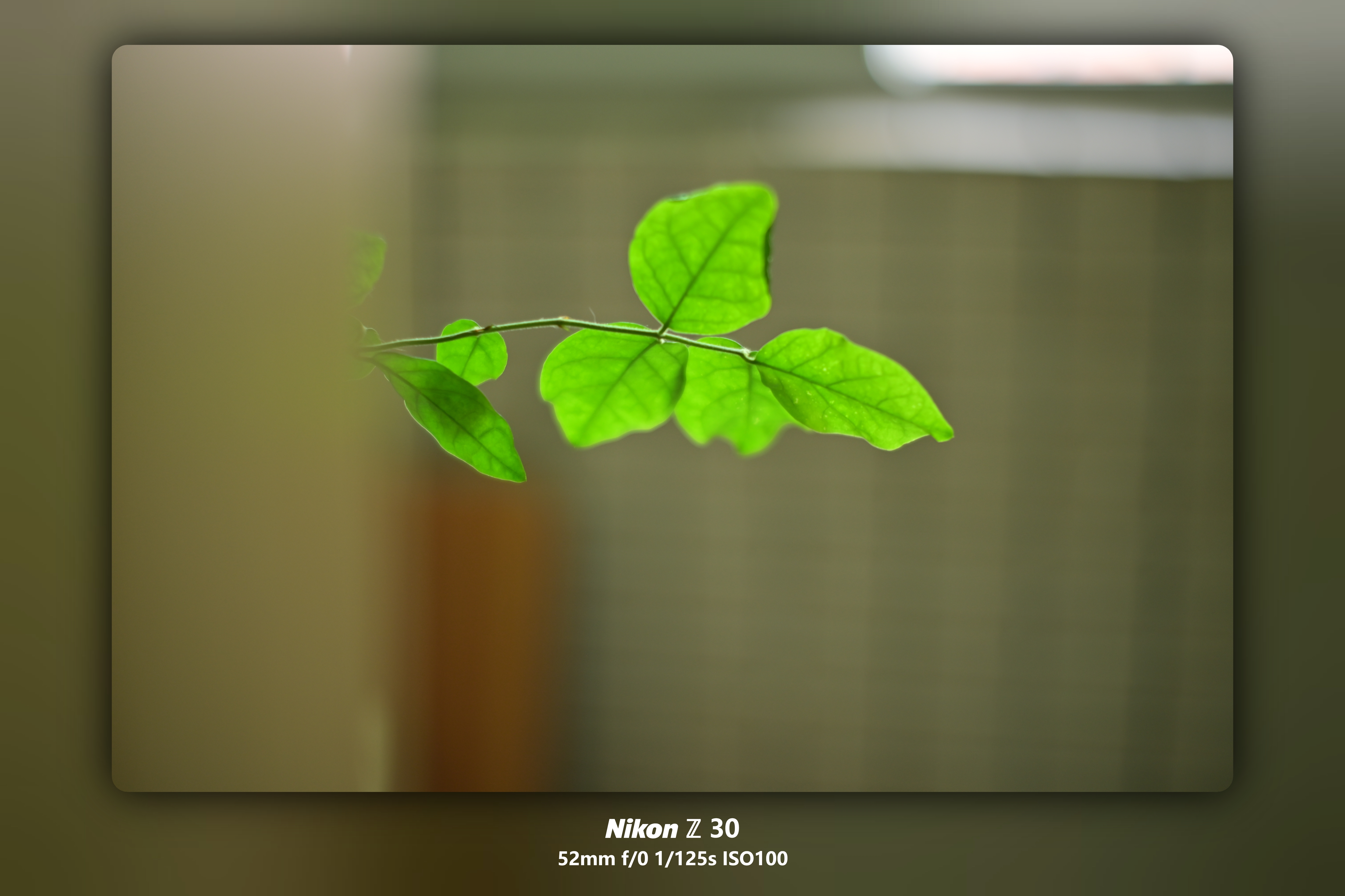
1 {% image https://fastly.jsdelivr.net/gh/Cactusinhand/images_repo/images/20240824211015.png download:true width:100% padding:10px bg:cyan fancybox:true %}
效果:
图片由 xaoxuu 拍摄于一个普通的阳光明媚的下午
由于 Stellar 主题的插件具有按需加载的特性,所以 Fancybox 插件默认也是已经配置好了的,在任意 image 标签中增加 fancybox:true 参数即可为特定图片开启缩放功能。如果一个页面没有任何地方使用,则不会加载 Fancybox 插件。如果您希望全站所有的 image 标签都开启此功能,可在主题配置文件中修改以下参数:
1 2 3 4 5 tag_plugins: image: fancybox:false
从 1.28.1 版本开始,如果想在页面中展示较小的图片,但在 fancybox 中展示较大的高清的图片,可以用 fancybox:大图链接 参数。
有用指数 :
17. video 视频 格式:
1
2
{% video [bilibili:video-id] [youtube:video-id] [ratio:16/9] [width:100%] [autoplay:false] %} 注: radio 可以指定 16/9, 4/3等比例
实现:
1
2
3
4
5
{% video bilibili:BV1rm421g77b autoplay:false ratio:4/3 %} {% video bilibili:BV1GP4y1d729 width:100% autoplay:0 %} {% video youtube:LB8KwiiUGy0 width:100% autoplay:0 %}
效果
VIDEO
还有 paper(信纸标签), reel(卷轴标签), audio(音频标签),觉得用处不大,跳过。
有用指数 :
容器类标签 1. grid 网格 格式:
1
2
3
4
5
6
{% grid [bg:box/card] [w:240px] [c:2] [gap:16px] [br:12px] %} <!-- cell --> left body <!-- cell --> right body {% endgrid %}
实现:
1
2
3
4
5
6
7
8
{% grid bg:box w:240px c:2 gap:16px br:12px %} <!-- cell --> 推荐: {code block} <!-- cell --> 不推荐: {code block} {% endgrid %}
效果:
推荐:
1
2
3
4
5
6
package mainimport "fmt" func main () }
不推荐:
1
2
3
4
5
package mainimport "fmt" func main () }
默认的布局为【最小宽度为 240px】即如果页面宽度大于 480px 则会显示为 2 列,大于 720px 则会显示为 3 列,以此类推,下面是效果:
实现:
1
2
3
4
5
6
7
8
9
10
11
12
13
14
{% grid %} <!-- cell --> {% image https://images.unsplash.com/photo-1653979731557-530f259e0c2c?ixlib=rb-4.0.3&ixid=MnwxMjA3fDB8MHxwaG90by1wYWdlfHx8fGVufDB8fHx8&auto=format&fit=crop&w=774&q=80 download:https://unsplash.com/photos/bcql6CtuNv0/download?ixid=MnwxMjA3fDB8MXx0b3BpY3x8NnNNVmpUTFNrZVF8fHx8fDJ8fDE2Njg4NDAxMDI&force=true %} <!-- cell --> **[Unsplash Photo ](https://unsplash.com/photos/bcql6CtuNv0 )** The Galactic Center is the rotational center of the Milky Way galaxy. Its central massive object is a supermassive black hole of about 4 million solar masses, which is called Sagittarius A*. Its mass is equal to four million suns. The center is located 25,800 light years away from Earth. > Ōwhiro Bay, Wellington, New Zealand > Published on May 31, 2022 > SONY, ILCE-6000 > Free to use under the Unsplash License {% endgrid %}
效果:
Unsplash Photo
The Galactic Center is the rotational center of the Milky Way galaxy. Its central massive object is a supermassive black hole of about 4 million solar masses, which is called Sagittarius A*. Its mass is equal to four million suns. The center is located 25,800 light years away from Earth.
Ōwhiro Bay, Wellington, New Zealand
如果要修改最小宽度,可以这样写:
1
2
3
{% grid w:350px %} ... {% endgrid %}
如果要固定为 2 列,可以这样写:
1
2
3
{% grid c:2 %} ... {% endgrid %}
样式背景:
1
2
3
4
5
6
7
8
9
10
11
12
13
14
15
16
17
18
19
20
21
22
23
24
25
26
普通 Box 样式: {% grid bg:box w:150px %} <!-- cell --> cell 1 <!-- cell --> cell 2 <!-- cell --> cell 3 <!-- cell --> cell 4 {% endgrid %} 可浮起的卡片样式: {% grid bg:card w:150px %} <!-- cell --> cell 1 <!-- cell --> cell 2 <!-- cell --> cell 3 <!-- cell --> cell 4 {% endgrid %}
效果:
普通 Box 样式:
可浮起的卡片样式:
设置间距:
默认间距为 16px,如果需要修改,可以这样写:
实现:
1
2
3
4
5
6
7
8
9
10
{% grid bg:card gap:32px w:120px %} <!-- cell --> cell 1 <!-- cell --> cell 2 <!-- cell --> cell 3 <!-- cell --> cell 4 {% endgrid %}
效果:
设置圆角半径
1
2
3
4
5
6
7
8
9
10
{% grid bg:card br:4px w:150px %} <!-- cell --> cell 1 <!-- cell --> cell 2 <!-- cell --> cell 3 <!-- cell --> cell 4 {% endgrid %}
这里的 br 是 border-radius 的缩写,虽然和 <br> 易混淆.
效果:
有用指数 :
2. tabs 格式:
1
2
3
{% tabs active:1/2 align:center %} content {% endtabs %}
实现:
example-in-tags.example view raw 1 2 3 4 5 6 7 8 9 10 11 12 13 14 15 16 17 18 {% tabs active:1/2 align:center %} <!-- tab 图片 --> {% image https://fastly.jsdelivr.net/gh/Cactusinhand/images_repo/images/20240824211015.png width:300px %} <!-- tab 代码块 --> ```go package main import "fmt" func main() { fmt.Println("hello, world!") } ``` <!-- tab 表格 --> | a | b | c | | --- | --- | --- | | a1 | b1 | c1 | | a2 | b2 | c2 | {% endtabs %}
效果:
1
2
3
4
5
6
package mainimport "fmt" func main () fmt.Println("hello, world!" ) }
有用指数 :
3. folding 折叠 格式:
1
2
3
4
5
6
7
8
{% folding [color:yellow] [child:codeblock] [open:false] title %} body {% endfolding %} child 指定子标签,比如 codeblock,这样就实现了嵌套 codeblock: true/false open: true/false color: red/orange/yellow/green/cyan/blue/purple/light/dark
实现:
1 {% folding color:green child:codeblock open:true main.go %}
1
2
3
4
5
package mainimport "fmt" func main () fmt.Println("hello world!" ) }
效果:
main.go
1
2
3
4
5
6
package mainimport "fmt" func main () fmt.Println("hello world!" ) }
危险,不要打开
警告+1
真的危险,不要打开
警告+1
最后一次警告,不要打开
警告+1 请科学探索
VIDEO
有用指数 :
4. folders 折叠 格式:
1
2
3
4
5
6
{% folders [color:white] %} <!-- folder [title 1] --> body 1 <!-- folder [title 2] --> body 2 {% endfolders %}
实现:
1
2
3
4
5
6
{% folders color:white %} <!-- folder title 1 --> body 1 <!-- folder title 2 --> body 2 {% endfolders %}
效果:
title 1
title 2
1
2
3
4
5
6
package mainimport "fmt" func main () fmt.Println("hello world!" ) }
title 3
有用指数 :
5. gallery 图库 格式:
1
2
3
4
5
6
{% gallery %}     {% endgallery %}
实现:
1
2
3
4
5
6
7
{% gallery %}   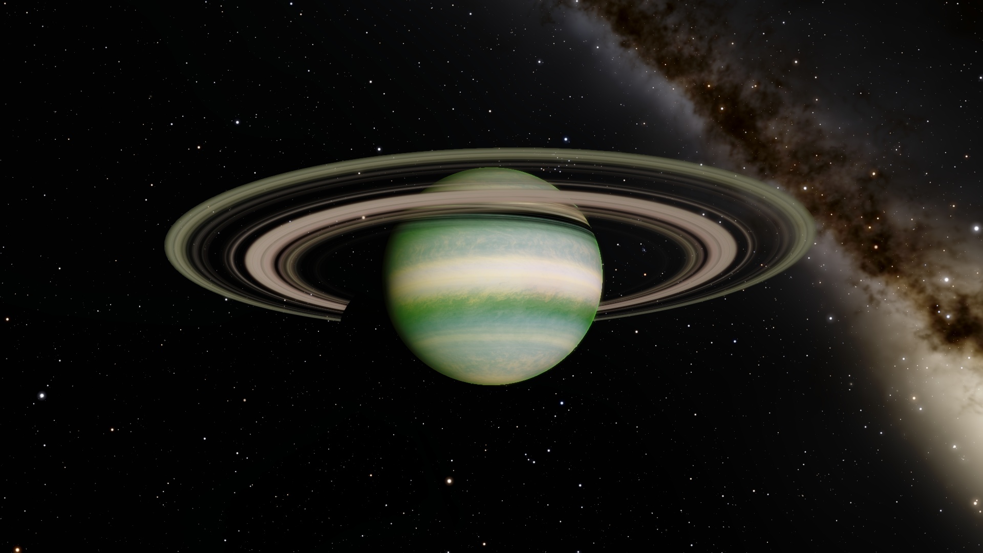  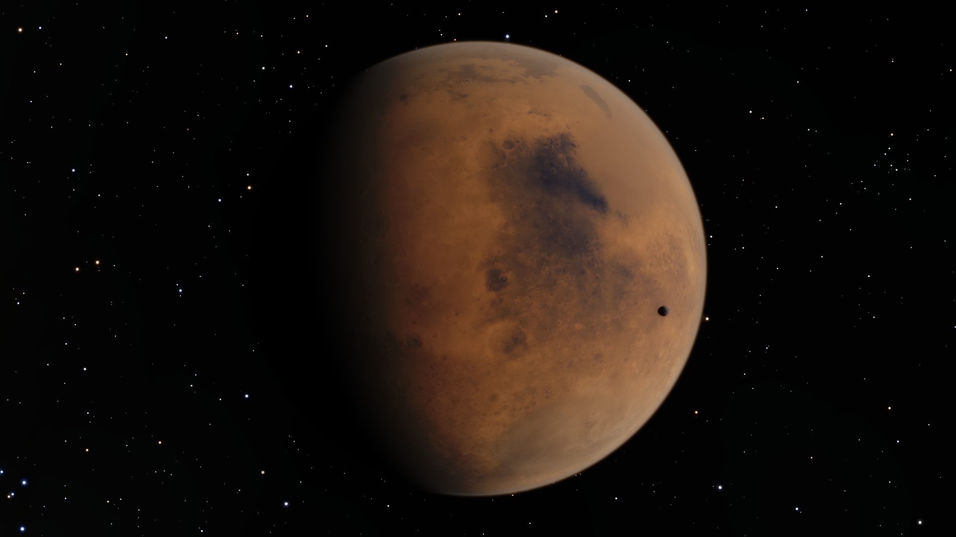 {% endgallery %}
1
2
3
4
5
6
7
8
{% gallery %}       {% endgallery %}
效果:
steam1
gallery01
gallery02
real01
real02
@tianhao_wang
@eberhard
@eberhard
@eberhard
@eberhard
@vklemen
有用指数 :
6. swiper 格式:
1
2
3
4
5
6
7
8
{% swiper [width:max] [effect:cards] %}    {% endswiper %} width:min/max effect:cards/coverflow
实现:
1
2
3
4
5
6
7
8
9
{% swiper width:max effect:cards %} {% img https://fastly.jsdelivr.net/gh/Cactusinhand/images_repo/images/20240824211015.png download:1 fancybox:1 '"title text" "alt text"' %} {% img https://fastly.jsdelivr.net/gh/Cactusinhand/images_ repo/images/20240824211015.png download:1 fancybox:1 '"title text" "alt text"' %}{% img https://fastly.jsdelivr.net/gh/Cactusinhand/images_repo/images/20240824211015.png download:1 fancybox:1 '"title text" "alt text"' %} {% endswiper %}
效果:
有用指数 :
7. banner 格式:
1
2
3
{% banner title [subtitle] [bg:src] [avatar:src] [link] %} {% navbar xxx %} {% endbanner %}
实现:
1
2
3
{% banner title subtitle %} {% navbar active:/about/ [Home ](/ ) [About ](/about/ ) [Comments ](#comments ) %} {% endbanner %}
效果:
用作文章摘要卡片
1
2
{% banner 博客进阶:自动化部署 本文讲了如何利用脚本和 GitHub Actions 简化博客搭建和部署流程,提高效率。 bg:/assets/xaoxuu/blog/2022-1126a@2x.jpg link:/blog/20221126/ %} {% endbanner %}
效果:
博客进阶:自动化部署
本文讲了如何利用脚本和 GitHub Actions 简化博客搭建和部署流程,提高效率。
或者用户个人资料页:
1
2
{% banner 某某 这是个人简介 avatar:/assets/xaoxuu/avatar/rect-256@2x.png bg:/assets/banner/nebula.jpg %} {% endbanner %}
有用指数 :
8. box note 标签就是使用 box 容器实现的,它们样式是相同的格式:
1
2
3
{% box [title] [color:color] [child:codeblock/tabs] %} content {% endbox %}
实现:
1
2
3
{% box 跟 note 是一样的 color:green child:tabs %} content {% endbox %}
效果:
有用指数 :
数据类标签 1. timeline 格式:
1
2
3
4
5
6
7
8
{% timeline %} <!-- node [timestamp 1] --> thing 1 <!-- node [timestamp 2] --> work 2 <!-- node [timestamp 3] --> work 3 {% endtimeline %}
实现:
1
2
3
4
5
6
7
8
9
10
{% timeline %} <!-- node Mon Aug 26 20:24:58 2024 --> today's work <!-- node Mon Aug 26 20:31:58 2024 +0800 --> yesterday's work <!-- node Sun Aug 25 12:24:11 2024 +0800 --> 2 day ago's work <!-- node on Feb 14 19:11:29 2022 --> 7 day ago's work {% endtimeline %}
效果:
有用指数 :
2. github card 格式:
1
2
3
4
5
{% ghcard user/repo [theme:xxx] %} or {% ghcard user %} example: {% ghcard xaoxuu %} {% ghcard xaoxuu/hexo-theme-stellar %} API: https://github.com/anuraghazra/github-readme-stats
实现:
1
2
3
{% ghcard xaoxuu %} {% ghcard xaoxuu/hexo-theme-stellar %} {% ghcard git/git %}
效果:
有用指数 :
3. sites 可以在任何位置插入网站卡片组,支持静态数据和动态数据,静态数据需要写在数据文件中:
blog/source/_data/links/sites_design.yml 1 2 3 4 5 - title: 标题 url: https:// cover: icon: description:
格式:
1 2 {% sites [group] [repo:owner/repo] [api:http] %} {% sites notion %}
实现:
先在 source/_data/links/ 下面新建两个配置文件:
1
2
3
4
5
- title: 英语笔记 url: https://showy-piranha-c54.notion.site/47abacfec233476d9650e3ece0c66217?v=b332588fa9d94495a23ce19c4b602dcc cover: /asset/banners/city_glitters.png icon: /asset/icons/bookmark.svg description: 由 Notion 生成,能不能打开看运气了。
1 2 3 4 5 - title: 免费图库 url: https://unsplash.com/ cover: /asset/banners/021.JPG icon: /asset/icons/bookmark.svg description: The internet's source for visuals.
然后在正文里引用:
1
2
{% sites Notion %} {% sites Unsplash %}
效果:
有用指数 :
4. 渲染外部 md 文件 格式:
实现:
1
2
3
{% folding %} {% md https://github.com/Cactusinhand/images_repo/blob/main/README.md %} {% endfolding %}
效果:
有用指数 :
其它 1. iframe 内联 格式:
1
2
3
4
### iframe ``` md 内联另外一个 iframe: {% iframe web_url %}
实现:
1 {% iframe https://www.runoob.com/tags/tag-iframe.html %}
效果:
有用指数 :
2. post_link 链接站内 post 注意:这是 Hexo 自身的语法,不是 Stellar 独有的
格式:
1
2
3
链接到另外一篇 post: {% post_link filename %} {% post_ link filename [title] [escape] %}
实现:
1 {% post_link git-bundle %}
效果:
git bundle 格式及应用 有用指数 :
3. include_code 注意:这是 Hexo 自身的语法,不是 Stellar 独有的
格式:
1
2
3
{% include_code [title] [lang:language] [from:line] [to:line] path/to/file %} from 参数从 1 开始
代码文件默认位置在source/downloads/code/,可以通过_config.yml中的code_dir来指定,默认是指定为downloads/code。
实现:
1 {% include_code lang:go from:1 to:50 main.go %}
效果:
main.go view raw 1 2 3 4 5 6 7 8 9 10 11 12 13 14 15 16 17 18 19 20 21 22 23 24 25 26 27 28 29 30 31 32 33 package mainimport ( "fmt" ) type T int16 type Pt struct { X, Y int }func main () var a = []int {1 , 2 , 3 } a = SliceInsert(a, 1 , 0 ) a = SliceInsert(a, 2 , -1 ) fmt.Println(a) var a1 = []string {"1" , "2" , "3" } a1 = SliceInsert(a1, 1 , "0" ) a1 = SliceInsert(a1, 2 , "-1" ) fmt.Println(a1) var a2 = []Pt{{1 , 2 }, {3 , 4 }} a2 = SliceInsert(a2, 1 , Pt{0 , 0 }) a2 = SliceInsert(a2, 2 , Pt{-1 , -1 }) fmt.Println(a2) } func SliceInsert [T any ](a []T, index int , value T) return append (a[:index], append ([]T{value}, a[index:]...)...) }
有用指数 :
4. keyboard 实现:
1 {% kbd A %} {% kbd B %} {% kbd C %}
效果:
A B C 有用指数 :
5. passswd 实现:
效果:
这是密码 有用指数 :
6. sup && sub 字体的上下标实现:
1 {% sup color:green upper %} word {% sub color:red lower %}
效果:
upper word lower 有用指数 :
Stellar 博客主题 测试 

 this is a quot
 这是一个 url 的示例


